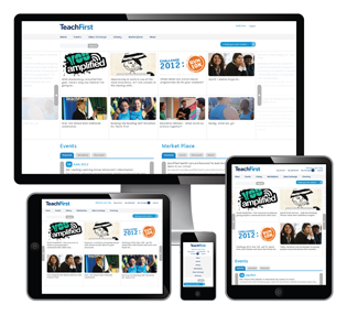 A responsive design means your site will be optimised to look good regardless of the device used to view it. Web visitors are used to the top sites providing a tailored viewing experience, the site looking different when viewed on a smartphone or tablet than when viewed on a PC, leading to less panning, scrolling and zooming to view the site. Now you can have the same level of professional viewing experience for your customers, putting you head and shoulders above your competitors.
Recent Work


